
Portfolio design and development for an international architecture studio disrupting the standards.
Differential is a computational architecture and design studio that thrives in the digital realm by harnessing cutting-edge algorithms and simulations to craft efficient and resilient structures. And with their growing business, they needed a digital portfolio that could best serve them in communicating who they are and reaching new clients. So this is where I was brought as an in-house designer, into their story, to help design their new portfolio, and develop it in Webflow.
Me as the In-house Site Designer
The Differential Team
Mark W. brought on as Senior Designer


Read about the design process ↓
Being new to the world of architecture, one of my first steps in this project was establishing an understanding of what the design landscape of architecture looks like and what could be done to set them apart.
But apart from just looking outwards, I also studied Differential’s existing brand guidelines and talked with their co-founders, Piotr & Krishna, to truly understand what they wanted personally, and needed commercially from their portfolio. And this gave me a few key requirements for their portfolio’s design:
Keep the design super simple.
Communicate what makes Differential so different.
Convey Differential's international impact.
Now with these key requirements established, I was then able to get straight into brainstorming, sketching and planning out what the information hierarchy of Differential’s site could look like.
To tangibly achieve their requirements, we translated the requirements into meaningful elements that could be designed. Namely, an interactive landing screen, how we showcase their projects, and communicating the unique services they offer.

1. Fluid Simulation
Connected to digital simulations and eliciting heat-map imagery.
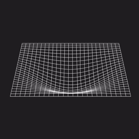
2. Gravity Grids
Reinforcing Differential’s parametric way of working through coded animation.
3. Vector Grids
Connecting to airflow and other directional simulations.
4. Animated Imagery
Focusing much more on Differential’s projects overlaid with ‘glitching’.
And finally after pitching and revising the options, we ultimately chose to move forward with the responsive vector fields alongside an overlayed text animation to introduce who Differential is.
With co-founders on opposite sides of the world, and clients everywhere in-between, Differential needed to communicate their projects in such a way that it was immediately recognizable for potential clients that they worked around the world.
We explored a few options for this. From their existing list of projects, to a gridded world map, but the most powerful option after testing, was an interactive globe that invited visitors to get a personal feel for the international impact.
Other explorations:


Providing such unique computational services, Differential needed to communicate their service’s meaning to potential clients through their iconography. Thankfully Differential already had a set of icons for some of their services, but as their service list grew, they needed new iconography to maintain a consistent brand identity.


These solutions weren’t decided on their own though, but rather they were part of an extensive and iterative design process that took place over months. Once, I had put together our prototypes, Mark was then brought in to refine and level up the visuals and the layout of the design, which included many really insightful changes for me, as someone still growing in the field, and Krish developed the coded interactions especially in the globe and landing screen. And when we had a design everyone was happy with, I got into developing it with Webflow.
Home


Home

Projects


Project Page


Contact
Contact
© 2024 Jedidiah Solomon.